The Journey
A comprehensive resource for discipleship leaders
As a collection of 54 modules written by over 20 authors, The Journey lived up to its name as a challenging design project. The stakeholder’s value of bold and fun design elements was challenged by the expansive source text copy. Increasing the final page size and creating varied module templates were some of the accommodations made in the design process.
-
Stakeholder/Client: Jason Weimer Director of Publishing for Cru Press
Project Segments (my work):
Client communication and planning, basic design, template and element creation, illustration, module layout and copy propagation, cover design.


“I was so glad to see you recognized today by your colleagues…what a blessing you have been to me, James and our team, especially where it came to the Expansion Plan and all your expertise to make that a great publication. Your honor and recognition is well deserved!”
Jim Dempsey
Chief Development Officer - Cru

Expansion Plan
Publication distributed annually to donors as a supplement and a summary of Cru’s annual report.
This piece falls within the boundaries of Cru’s visual branding guidelines and all written content adheres to Cru’s written style guide (modified AP style). Because of a short turnaround window, much of the copy was generated concurrently with the assembly of the layout/design. Working alongside the team of stakeholders/clients, I helped refined the written communication in addition to visual design.
-
Stakeholder/Client: Jim Dempsey, Bob Francis, James Cusson, Karene Crebs
Project Segments (my work):
Client communication and planning, basic design, visual structure and template creation, illustration, text layout, image editing, chart and data organization.Photography: John Cliver, Tim Niegocki


Golf Scramble
Fundraiser for the local Cru movement at Clemson University
Since the “first annual” event in 2017, the grass-green golf aesthetic was refined in further iterations of the design to showcase business logos and other sponsors over a dark background. The logo elements are kept somewhat generic in order to showcase sponsorships and other important communication but it marks a wide range of on-site materials, signs and promotional products.
-
Stakeholder/Client: Weston Tripp (Director, Clemson Area Cru Team)

Large grommeted vinyl banner displayed at course entrance

Reusable corrugated poly yard sign

Event partner recognition signage
“I love your design style! -Your use of color and design elements in your projects. Your illustration skills are awesome and your work is so clean, keep up the great work!”
Priscilla Alvarez
Senior Designer - Cru, Creative One Media
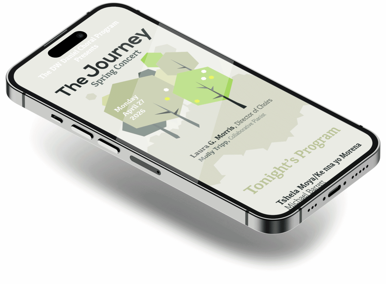
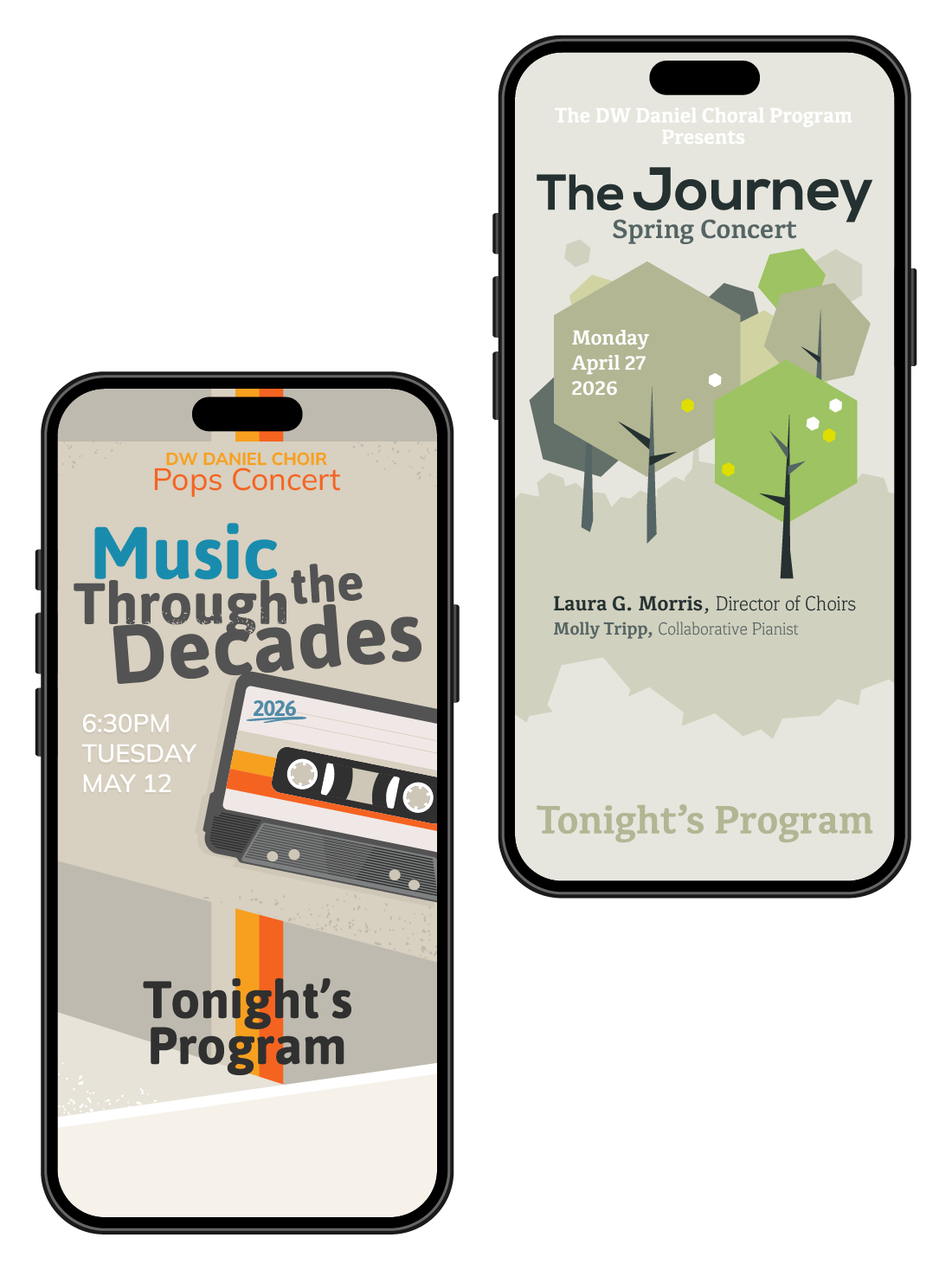
Concert Program Redesigns
Usability and Design Update to high school music program event schedules.
A design exercise prompted by the difficult to read text and page layout style of the digital programs offered at High School Band and Chorus performances. Text copy is scaled up and organized to be viewed in a single column as the viewer scrolls. These samples work simply as images viewable (fit-to-width) on smartphones which are easy to share and require no persistent internet connection within a concert hall or auditorium.